Why the Same Blue Changes Beside a Different Colour
Learn why the same blue appears to shift beside different colours, with a paper comparison that helps you separate the swatch from its surroundings.
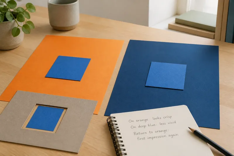
The common mistake with the same blue is to blame the swatch when it looks different on another sheet of paper. That can send you searching for a replacement when the apparent change comes from the colours around it, not from the blue itself. A simple comparison shows how the same blue changes beside a different colour.
This effect is called simultaneous contrast: a colour’s neighbours influence how we perceive it while we look at it. The blue remains the same piece of paper, yet it can seem warmer, cooler, brighter or duller beside different colours. A small paper comparison makes that shift easier to notice without relying on memory.
A blue paper problem
Imagine you are arranging a small display for a community reading room. You have one square of blue construction paper and two larger sheets, one pale orange and one deep blue. You want to decide how the small square reads beside the noticeboard’s colours. This is an invented situation, but the observation is something you can make with ordinary paper and steady indoor light.
Set the blue square on the pale orange sheet. Look at the square, not the whole arrangement. Then move that same square onto the deep blue sheet and look again. It may seem more distinct in one position and less distinct in the other. The centre has not changed; only its surround has.
Keep the comparison fair. Use the same square, keep the sheets flat, and look from the same seat under steady light. Avoid coloured lamps or a bright patch of direct sun, which can change the appearance of both papers. Give your eyes a moment to settle after each move, but do not stare for a long time.
What the neighbours do
When two colours meet, the boundary gives your eye a direct point of comparison. Differences in hue and lightness can make the central blue seem more distinct or less so. A blue beside orange may look more distinctly blue; beside a neighbouring blue, it may seem less vivid or take on a different cast. The impression depends on the papers and the light.
Lightness matters as well as hue. Put a medium-blue square on a pale sheet, then on a much darker one. The square can seem darker against the pale background and lighter against the dark one. This is a perceptual comparison, not a physical alteration to the pigment.
Edges often make a shift easiest to see. The centre of a broad blue patch may seem fairly stable, while the narrow border touching another colour looks more striking. A surround does not have to cover much of your view to affect the impression.
Simultaneous contrast is not the only reason a colour seems different from place to place. The lamp, direction of light, shadows, surface texture and the state of your vision can all contribute. In this comparison, the useful clue is that the same central square changes in appearance when you change only its immediate surround.
A controlled paper comparison
Choose matte paper and one small blue rectangle. Find two larger sheets in visibly different colours: orange, a neighbouring blue or neutral grey are useful options. They do not need to match a formal chart. The aim is to make the surrounds easy to distinguish.
- Check the centre piece. If you have one blue rectangle, use it for every comparison; if you have several, choose one and set the others aside.
- Check the first backing. If it gives a clear, even field around the blue, place the rectangle in its centre; if it has a fold or patch of shadow, choose another sheet.
- Check the second backing. If its colour is visibly different from the first, move the same rectangle onto it; if it looks too similar, select a more contrasting sheet.
- Check the lighting. If both sheets receive steady, even light, compare them from the same seat; if a shadow or sun patch crosses either one, wait or move to a steadier spot.
- Check the middle and edge. If the centre and border seem different, note both impressions; if you only notice the edge, look at the middle again before recording a description.
- Check your wording. If the blue seems cooler, duller or lighter on one backing, write that comparison down; if you cannot name a shift, record “no clear difference” rather than guessing.
- Check the return view. If the first impression returns when the rectangle goes back to the first backing, note that it follows the surround; if it does not, check for changes in light or viewing position.
Say you have one blue paper square, a matte orange sheet and a matte deep-blue sheet. You place the square on orange and write “looks crisp”. You move it to the deep-blue sheet and write “less vivid”, then return it to orange and see the first impression again. The expected result is a difference that tracks the backing, while the square itself remains untouched. If the lighting shifted during the comparison, the result is less clear and you should repeat it under steadier light.
For another view, cut a small opening in a plain grey card and look at the blue through it. The card masks some coloured surroundings and makes it easier to attend to the central paper. Remove the mask and compare again. This does not reveal an absolute colour; it gives you a different viewing condition.
Questions about blue shifts?
Does blue always look brighter on orange?
No. The effect depends on the particular blue and orange, their lightness and the viewing conditions. Treat “brighter” as something to observe in your paper pair, not a rule that applies to every pair.
Why does a blue surround affect blue differently?
A nearby blue gives your eye a close colour for comparison, so the central square may seem less distinct or appear to shift in hue. The result varies with how similar the two blues are and how their lightnesses compare.
Will the paper change if I move it?
Moving the paper between backgrounds does not, by itself, alter its printed or dyed colour. A change in sunlight, shadow or lamp colour can alter the light reaching it, so keep those conditions steady if you want to focus on the surround.
Can I try this on a screen?
Yes, as a visual comparison, but a screen adds its own brightness, settings and room light. Keep one blue shape fixed and change only its digital background; do not treat the screen as a dependable substitute for physical paper.
Notice colour relationships
The same observation can help when arranging colours on a notice, collage or mood board. Before rejecting a blue for seeming too cold or dull, view it in the arrangement where it will sit. The appearance of a blue patch depends partly on the adjacent colours and the conditions in which you see it.
Paper cut-outs let you move a colour without changing the central sample. In a digital layout, keep the central swatch fixed and alter one surrounding colour at a time. Avoid changing its brightness or opacity as well, or you will be comparing more than one variable.
A paper comparison cannot predict every room or display. A large coloured wall, a narrow paper border and a screen in a dim room are different viewing settings. Use the comparison to notice how adjacency affects appearance, not to assign a permanent label such as “always warm” to a particular blue.
Colour names can make the distinction harder to discuss. One person may call a swatch turquoise while another calls it blue-green; both may still agree that it looks duller beside a particular backing. Describe what you see in comparative terms, such as “the blue looks less vivid on the blue sheet than on the orange one”. That ties the observation to the arrangement rather than to a disputed name.
Separate surround from light
When the blue seems to shift, check what changed around it before changing the sample itself. Was the backing different? Did a shadow cross the paper? Did you move nearer a window or turn on a coloured lamp? These questions help distinguish a surround effect from changes in illumination or viewing position.
Then describe the effect without overclaiming. “It looks cooler here” reports your perception in that arrangement. It does not mean the paper contains a different pigment, nor does it mean every viewer will describe the shift in the same words. People can notice the same contrast and choose different language for it.
Keep returning to the same blue on each background. That makes the central point visible: a swatch is not perceived in isolation. When the same blue changes beside a different colour, check the surrounding colours and the light before deciding the blue itself is at fault.