Matte or Gloss: Two Ways a Surface Meets Light
Matte or gloss finishes change how colour reads. Compare samples in their intended light to choose a surface that keeps colour clear or adds a lively sheen.
The common mistake with matte or gloss is choosing by colour alone; the finish can make the same pigment look softer, brighter or harder to read. Matte or gloss changes how light meets a surface, so a colour sample that looks clear in a shop may behave differently beside a window or under a lamp.
Reflection sets the mood
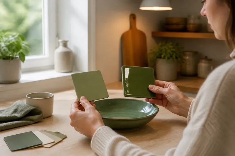
A glossy surface returns light in a concentrated reflection. Look at a glazed ceramic bowl near a lamp and you may see a bright patch that shifts as you move. The reflection can partly cover the colour beneath it, while its crisp highlight makes the object feel vivid and polished.
A matte surface scatters reflected light across a broader area. On an uncoated sheet of coloured paper, the hue tends to remain legible from several viewing angles, with less distinct shine. The result can feel quiet and tactile, though fine colour differences may seem less punchy than on a glossy surface.
Neither finish contains a different colour by definition. The pigment or dye may be the same; what changes is the visible balance between coloured light from the surface and reflections of the surroundings. Gloss can pick up a window, ceiling lamp or passing figure. Matte usually makes those reflections less sharply defined.
Matte or gloss colour
Choose matte when you want colour to hold a steady, soft presence rather than announce itself with highlights. It suits a book cover meant to feel calm, a painted clay planter with a powdery look, or a display card that should remain easy to view under varied room lighting.
Choose gloss when you want a smooth, bright impression or a surface that catches the eye. A glazed tile can make a saturated colour appear lively beside a window, while a glossy label can give a small object a clean, finished look. The effect depends on the light source: a neat highlight under one lamp may become distracting glare beneath another.
Think about the viewing position as well as the finish. A surface seen straight on may show a reflection that disappears when viewed from the side. If people walk past it, the changing highlight becomes part of the visual experience. For a colour sample held in the hand, turn it slowly and notice whether the hue remains clear or slips behind a bright reflection.
Highlights and texture
Gloss makes small variations in a surface easier to notice when light skims across it. A tiny ripple in varnish or a shallow mark on a coated panel can catch a bright line. That can add depth and liveliness, but it can also draw attention to unevenness.
Matte finishes often soften sharp highlights, so a surface may look more uniform at a glance. They do not erase texture: paper grain or brush marks can still be visible, especially in side light. Instead, texture tends to read through shifts in tone and shadow rather than a mirror-like gleam.
Use the viewing distance that matters. A small handmade object may reward close inspection, where its grain and finish become part of its character. A broad painted panel is often seen from farther away, where a scattered reflection can make the colour feel more even. Check the surface from both distances before settling on a finish.
Light changes the answer
Under a direct lamp, gloss can produce a defined highlight that competes with the colour. Under a large, diffused light source, the same finish may show a softer, broader reflection. Matte also responds to its setting: a dark matte surface can absorb much of the room’s visual brightness, while a pale one may still reflect plenty of light without sharp glare.
Look at the intended surface where it will be seen, if possible. A phone torch held at an angle can reveal how a glossy coating catches light, but it is not a substitute for checking under the room’s usual lighting. For a portable object, view it near a window and again under indoor light. Note whether the reflection adds a useful glint or obscures the colour you care about.
Imagine you are choosing a finish for a small green ceramic dish on a kitchen shelf. You have a matte sample and a gloss sample in the same green. You place each beside the dish, first near the kitchen window and then under the ceiling lamp, and turn them from the usual viewing position. The matte sample keeps the green more consistently visible; the gloss sample creates a shifting bright patch. If clear colour is the priority, the expected choice is matte; if a lively glint matters more, gloss offers that effect at the cost of occasional reflection.
Where each finish fits
- Painted objects: If the surface should have a soft, chalk-like character, choose matte; if a sharper impression of colour and form is wanted, choose gloss.
- Printed paper: If reflections interfere with reading, choose uncoated matte stock; if image sheen is the priority and the sheet will avoid direct overhead glare, consider coated gloss.
- Ceramics and glass: If a distinct reflected glint is wanted, choose gloss; if subdued reflections and easier inspection from changing angles matter more, consider matte glaze.
- Small labels: If lettering must stay easy to read under direct room light, choose matte; if shelf visibility matters more and reflections will not cover the text, consider gloss.
These are visual tendencies, not fixed rules. Coatings vary, and satin sits between the two: it has some sheen without the sharp reflection associated with high gloss. Place samples side by side and view them at the distance and angle where the finished surface will usually be seen.
Choosing the surface?
Does gloss make colour brighter?
Gloss can make colour seem more vivid by adding a clear highlight, but that same reflection may cover part of the coloured area. The result depends on the light and viewing angle, so brightness and colour clarity are not always the same thing.
Does matte hide surface flaws?
Matte tends to reduce sharp highlights that reveal small marks, which can make a surface appear more even from a distance. Close up, texture and irregularities may still be visible, especially where light falls across the surface.
Is satin halfway between matte and gloss?
Satin usually offers a modest sheen rather than a fully dull or sharply reflective look. Its appearance varies by product, so compare the actual finish under the lighting where it will be viewed.
How can I compare finishes at home?
Put samples beside one another and view them near a window, under a room lamp and from the normal viewing position. Turn or move each sample slightly; the changing highlight will show whether reflection helps the colour or gets in its way.
Make the final choice
Start with the visual quality you want: a colour that stays quiet and readable, or one that gains energy from a shifting sheen. Then consider the light direction, surface texture and how close people will stand. When product labels or manufacturer instructions affect which finish is suitable, follow them rather than judging appearance alone.
For a final comparison, hold the samples against nearby materials without placing them directly under a bright reflection. Matte or gloss can change the surface’s whole character, but the useful question is specific: should the light become part of the colour’s display, or should it mostly stay out of the way?