How to Use a Colour Wheel Without Trusting It Too Much
Use a colour wheel to compare hues and organise a palette, then check lightness, saturation, material and lighting before choosing real colours.
The common mistake with a colour wheel is treating its neat circle as a complete map of colour. That can make a useful palette feel confusing: colours close together on a printed wheel may behave differently in a room, on a screen or under a lamp. Use the wheel to describe relationships, not to decide what you see.
A colour wheel arranges hues so you can discuss which ones sit near each other and which lie opposite. It can give you a starting point for a palette, but it leaves out factors that shape how colours appear in actual surroundings.
What the wheel shows
A wheel places hues in a loop. Red leads towards orange, then yellow, green, blue and violet, before the sequence returns towards red. The circle makes transitions easy to see and offers shared terms for comparing hues.
Colours close together are often called analogous. Colours across from one another are often called complementary. These terms describe positions on a particular wheel; they are not instructions for how a palette must look.
A wheel is a simplified model, not a universal instrument with one exact arrangement. Different wheels may use different primary colours or divide transitions differently. Choose one wheel for a comparison and use it consistently.
What the wheel leaves out
A wheel usually presents a narrow band of colour. Actual colours also vary in lightness and saturation. Lightness describes how light or dark a colour appears; saturation describes how vivid or muted it looks. A bright yellow and a dusty yellow may occupy similar positions on a wheel but feel far apart in use.
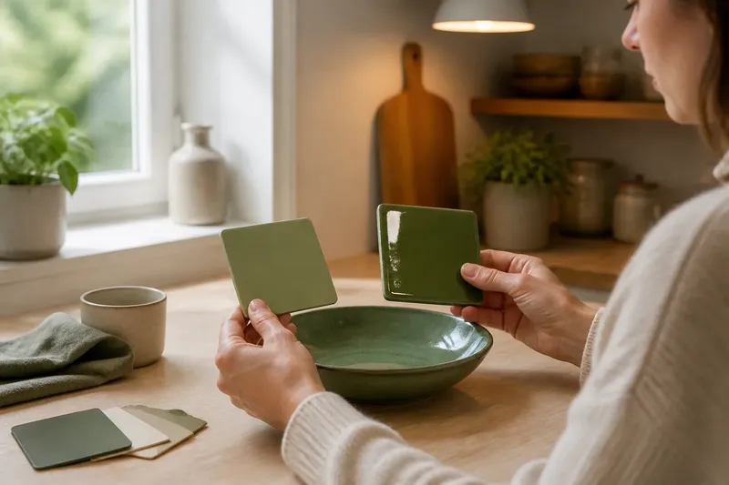
Material and lighting matter too. A screen produces light, while a printed page reflects light from its surroundings. Fabric, paint and paper can each make a colour appear different. Use a screen to explore a rough relationship, then check a physical sample in the place and light where it will be seen.
When comparing samples, place them together under similar light. Describe visible differences: one looks warmer, cooler, duller or more vivid. That is more useful than arguing over whether a shade is teal, blue-green or simply green.
How to organise a palette
If a group of colours feels scattered, identify the job each one needs to do. A background, an accent and a repeated detail do not need equal visual weight. Then use the wheel to ask whether the hues sit near one another or form a deliberate contrast. If they do not, that may be a choice rather than a flaw.
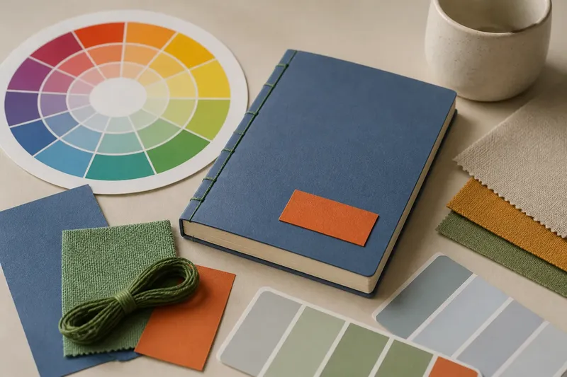
Imagine you are choosing a cover for a handmade notebook. Your starting materials are a muted blue card, green thread and a small orange label. First, place the blue and green together and note that they sit near each other on your chosen wheel. Next, compare the orange with the blue and note their contrasting positions. Finally, keep the orange label small because you want the card and thread to dominate. The result is a palette with a close hue pairing and a contained accent; the wheel describes the relationship, while placement sets the emphasis.
How to soften contrast
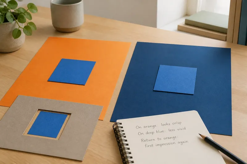
Opposite positions on a wheel can suggest a strong contrast, but the diagram cannot tell you how forceful the pairing will feel in an arrangement. Lightness, vividness, area and material all affect what catches the eye.
If an opposite pair feels harsh, check whether both colours are vivid or occupy large areas. You can keep one as the main field and reduce the other to a small detail, or choose quieter versions of the same hues. Compare physical swatches or colour blocks at the scale you expect to use: tiny marks on a wheel cannot show how a large wall, narrow border or small button will read.
Questions about colour wheels?
What are primary colours?
Primary colours are the starting colours in a particular system for organising or mixing colour. The chosen set depends on the system, so the term does not identify one universal trio for every purpose.
What are complementary colours?
They are hues placed opposite one another on a given wheel. The term describes their positions in that model; it does not mean every opposite pair will look balanced in every setting.
Can a colour wheel predict a finished palette?
It can suggest relationships and help you compare hue positions. It cannot fully account for lightness, saturation, material, scale or the light in the place where the colours will be seen.
Which colour wheel should I use?
Choose one clear wheel and keep using it for the comparison at hand. If another wheel places a hue differently, treat that as a difference between models rather than proof that your observation is wrong.
Checks before choosing
- Observe whether the samples are under similar light; if they are, compare them together, but if not, move them to the same light before deciding.
- Observe whether the hues sit near one another or opposite on your chosen wheel; if they do, use that relationship as a palette starting point, but if not, decide whether the difference is intentional or choose closer hues.
- Observe whether one colour is much brighter or darker; if it is, judge the contrast with that difference in mind, but if not, check vividness and area next.
- Observe whether one colour looks more vivid or muted; if it does, decide whether it should be the accent, but if not, compare the amount of space each colour will occupy.
- Observe whether the samples are the same material as the finished choice; if they are, assess them in their intended place, but if not, obtain a sample of the actual material before settling on the colour.
- Observe whether the palette still reads clearly at the intended size; if it does, keep the balance, but if not, enlarge the main colour’s share or reduce the competing accent.
Use a colour wheel to name a relationship, then check the qualities it leaves out: lightness, saturation, material, scale and lighting. For paint, fabric, paper or another product, follow the maker’s sample guidance when it matters. The wheel gives you a common vocabulary; the real samples and their surroundings help you make the final choice.